One Arabesque in the small world of OD webmaps (pre-print)
Nicolas Roelandt
Univ. Gustave Eiffel/AMEFrançoise Bahoken
Univ. Gustave Eiffel/AMEGrégoire Le Campion
CNRS/UMR PassagesLaurent Jégou
Univ. Toulouse Jean Jaurès/UMR LISSTMarion Maisonobe
CNRS/UMR Géographie-citésBoris Mericskay
Univ Rennes 2/ESO-RennesEtienne Côme
Univ. Gustave Eiffel/COSYS/GRETTIAarticle_FOSS4G2021.RmdAbstract
Arabesque is an application for the exploration and geovisualisation of origin-destination flows (or spatial networks), developed within the framework of the Univ. Gustave Eiffel (ex. IFSTTAR)-funded research project geographic flow visualisation (gflowiz) geoflowiz, in collaboration with the CNRS. It allows both the exploration and the filtering of OD data and their representation, with a strong emphasis on geographic information layering and features' semiology. The key-objective is to propose an easy way to produce a modern cartography (a geovisualisation) of thematic flows (e.g. bilateral flow volume), at several geographic scales, even from your own datasets. The objective of this article is to position Arabesque in the range of geoweb applications for producing flow maps, by comparing its functionalities with those of similar web applications— Magrit, Kepler.gl, flowmap.blue —pointing out their respective advantages and limitations. The analysis of its functionalities is compared on the same flow dataset— MOBSCO, i.e. a dataset describing the school mobility of French pupils and students on a given year —for a practical and empirical "validation" of its contributions. We demonstrate that the configurations and appearances of these tools’ visual output depend largely on the culture of their developers, and on the use and audiences for which they have been developed.
Introduction
Arabesque is a Web application for the exploration and geovisualisation of origin-destination (OD) flows. Its ongoing development since 2018 comes at the same time as several other new online flow mapping tools. These new online tools are part of the same family within the wider universe of existing IT solutions for mapping relational and origin-destination data. Within this family of online tools, there is a certain variety: some are aimed at a wide range of users, and others are more specific and aimed at more specialised audiences. Most of them share the fact that they rely on common and open data-visualisation, mapping and geo-processing libraries of functions. However, only some of them are entirely free and open-source, as is Arabesque. The objective of this article is to position Arabesque in the range of geoweb applications for producing flow maps, by comparing its functionalities with those of comparable applications, pointing out their respective advantages and limitations.
To provide a practical and empirical "validation" of Arabesque contribution and specificity, we first select a small number of flow mapping tools sharing common characteristics with Arabesque and second, compare these tools using the same flow dataset: MOBSCO, i.e. a dataset describing the school mobility of French pupils and students on a given year. In doing so, we highlight the complementary effects between these tools which, for the same set of data, make it possible to obtain different types of representations. Those configurations and appearances depend largely on the culture of the developers of these tools, and on the use and audiences for which they have been developed. The differences between these tools bring out two different cultures: that of thematic mapping and statistical analysis of information and the more 'dataviz' oriented culture of information exploration. We think that this dividing line is somehow reminiscent and related to the one described and analysed by Carmichael and Marron between data science and statistics (2018).
The small world of Origin – Destination matrix mapping
The development of online web mapping tools
There are currently a growing number of computer solutions for mapping flows and origin-destination (OD) matrix with one's own data. According to their environment, these tools can be classified into 3 main families: 1) desktop GIS softwares (e.g. QGIS, ArcGIS); 2) programming languages with (geo)data analysis capabilities (e.g. Python/R); 3) online tools with user-friendly interfaces.
As demonstrated in a recently published paper (Bahoken et al., 2020), the latter category has tended to develop further in recent years. This dynamics is concomitant with and part of a wider phenomenon: the rise of the geoweb (Hackley et al., 2008; Mericksay and Roche, 2011). But among online mapping tools, flow mapping tools tended to emerge in greater numbers from the mid-2010s onwards, taking advantage of the opportunities offered by the release of feature libraries such as D3 (Botstock et al., 2011) and new technologies such as WebGL or vector tiles that opened up a range of new possibilities for online graphics and mapping. The growing attraction to open source tools and replicable approaches in the world of mapping and geomatics also fostered this dynamic (Giraud and Lambert, 2017).
In a recent contribution, Bahoken (2020) provided a review of about 80 flow-mapping web applications resulting from a digital curation. Among all these applications, only a minority are offering users the possibility of importing, analysing, exploring and mapping their own dataset. The majority of retrieved applications only allows the exploration of a preselected dataset on a certain thematic (i.e. global trade, urban mobilities, migration flows, scientific collaboration).
Flow mapping tools
Among the 80 web applications listed in that review of flow map, 8 have the particularity of allowing users to import their own dataset, as does Arabesque. There are Kepler.gl, Magrit, Flowmap.blue, Tableau, CARTO, Flourish, ArcGIS Online, and NETSCITY. Of course, this list of online flow mapping applications might not be exhaustive and is open to suggestions to enrich it.
To this purpose, the fruits of the above-mentioned review of web applications for flow mapping are shared in the form of a collaborative dashboard open to any contribution. Possible contributions to this collaborative work of digital curation can be modifications or enrichment of metadata, addition of new applications and of course reuse in the context of other research (the paper: Bahoken et al., 2020; the dashboard: Le Campion and Nguyen, 2019).
While many of the tools identified are based on open-source data-visualisation, mapping and geo-processing libraries, they do not all have the same degree of accessibility, as shown by Table 1. Among these 8 flow mapping web applications we identified for the study, only 4 are entirely free and open: Arabesque, Kepler.gl, Magrit, and Flowmap.blue.
In the perspective of comparing Arabesque to tools in the same category, and in the logic of presenting in this article research results that are themselves as open and reproducible as possible, we have decided to operate our benchmark on those 4 applications (developed between 2017 and 2019). Thus, the main criterion that allowed us to choose the applications finally retained for the test is their accessibility.
| Flow mapping web tools | FOSS4G compliance | |
| open | free | |
| Kepler.gl | yes | yes |
| Magrit | yes | yes |
| Flowmap.blue | yes | yes |
| Tableau | no | no |
| CARTO | yes | no |
| Flourish | no | yes |
| Arabesque | yes | yes |
| ArcGIS Online | no | no |
| NETSCITY | not yet | yes |
Table 1. Software licensing of a selection of online flow mapping tools
While it also allows users to map their own data, NETSCITY has the particularity of being more specifically designed for mapping science data (i.e. scientific collaborations). Moreover, being still in beta version, the code sharing operation of this application is not yet finalized; thus justifying excluding it from the following comparison with Arabesque.
The MOBSCO dataset
To perform our comparison of Kepler.gl, Magrit and Flowmap.blue with Arabesque, we selected a flow dataset that will be visualized in each software. For this purpose, we choose a dataset which remains little known. It is the detailed file of the French population census describing the school mobility of individuals and, more specifically, commuting to and from the place of study (MOBSCO). In spite of its great thematic interest for mobility researchers in France, it has not been the object of much exploitation and valorisation until now.
It is a product of the French National Institute for Statistics and Economic Studies (INSEE) and is available online. It comprises two sorting variables: the municipality of residence and that of the place of study (including in bordering countries). Its scope encompasses individuals enrolled in an education establishment and aged 2 years or over. The source file contains 4,730,521 records and 22 variables. For each statistical individual, it lists its municipality of residence, its place of study, its age group, and highest diploma, the socio-professional category of the households he belongs to, the number of persons and cars of the households.
The size of the dataset being too large for online flow mapping tools, we preformatted and aggregated it at the departmental level (higher administrative level than municipalities). We also filtered the data to only keep records for students only (higher diploma is at least the baccalaureat), because they are more likely to move outside their municipality of residence to study. The final dataset contains 27090 records. In addition, we used the ADMINEXPRESS database of 24-09-2019 provided by the French National Geographic Institute (IGN) for the departments’ georeferencing. We limited our analysis to the France metropolitan area. The nodes were created by calculating the centroids of the departments.
Benchmarking/ Use test
In this section, we are testing 4 flowmap geoweb tools for OD flows that are interfaced on the web, with the same dataset, in order to compare them, both in terms of ergonomics and rendering.
The objective is to position Arabesque in the range of geoweb applications for producing flow maps, by comparing its functionalities with those of comparable applications, pointing out their respective advantages and limitations.
Another interest of this comparative approach is to show the dependence of the rendering: from the type and style of the map to the tool. This dependence is also linked to the audience for which the application is intended, depending on whether its interest will be focused on the exploration and analysis of cartographic data or on cartographic editing. In the first subsection, we introduce the 4 applications, their specificities, the audience and use type for which they were developed. In the second subsection, we present the result of the comparative test we performed with the MOBSCO dataset, and in the third subsection we present a summary diagram showing the specificities of each application at each step of the data processing chain, from data pre-formatting to exporting, including the different analysis options available.
Presentation of the flow mapping web applications
Arabesque
Arabesque is an application for the exploration and geovisualisation of origin-destination flows (or spatial networks), developed within the framework of the Univ. Gustave Eiffel (ex.IFSTTAR)-funded research project geographic flow visualisation (gflowiz) geoflowiz, in collaboration with the CNRS. Its development benefits from several well known open-source data-visualisation, mapping and geo-processing libraries (OpenLayers, D3, TurfJS) and build also upon well known open data-sets (OpenStreetMap, NaturalEarthData) It allows both the exploration and the filtering of OD data and their representation, with a strong emphasis on geographic information layering and features' semiology. The key-objective is to propose an easy way to produce a modern cartography (a geovisualisation) of thematic flows (e.g. bilateral flow volume), at several geographic scales, even from your own datasets. Arabesque main public is academia (researcher and students) but with the objective to be simple to use for anyone. Arabesque was launched in 2019 by Côme E. (2019) under a BSD 2-clause licence.
Kepler.gl
Launched in 2018, Kepler.gl is an open source geovisualisation tool designed for complex datasets (large, spatio-temporal, 3D). Built with Deck.gl (Wang, 2019), Kepler.gl uses WebGL to display large data sets in multiple forms quickly and efficiently. For example, it provides dot maps, choropleth maps, heatmaps, clusters or even 3D grids (He, 2020). Developed by the technology company Uber, this application allows both exploring and mapping large and complex geographic datasets thanks to client-side rendering. All layer geometry calculations are GPU accelerated, smoothly rendering millions of points and making kepler.gl a much more powerful web tool than traditional mapping software and other web mapping solutions. The target audience is that of data journalists and data scientists whose objective is above all to explore large data sets and not to correctly represent flow logics. Kepler.gl is available under a MIT licence.
Flowmap.blue
This web application was firstly launched in 2019 by Boyandin I. (2019). Only developed in JavaScript using flowmap.gl, deck.gl, mapbox, d3, blueprint and CARTOColors, the tool is designed to explore and create flow maps from Google Sheets or tabular data in a web browser. Additional tools are also available such as geocoding, matrix converter (wide / long formats). Flowmap.blue allows automatic clustering, provides global data filtering and automatically adapts the scales of the flow thickness and colors. The tool is however limited in its style, the type of flow map that can be made and the projection proposed. It’s prime objective seems to allow the production of a nice flow map easily and very quickly, in response to the requirements of data journalists and data scientists. Flowmap.blue is also available under a MIT licence.
Magrit
This thematic web mapping application was launched in 2017 (Viry et al., 2018). It is free under the CeCILL licence and compatible with the GNU GPL. Mainly developed in Python and modern JS (ES6) Javascript using notably the d3.js library, its code is already open. Magrit is mainly intended for social scientists and thematic cartographers as it is firstly designed to teach statistical cartography, respecting the rules of cartographic semiology (Bertin, 1967). To do so, it offers 12 types of maps (e.g. choropleth and smoothed choropleth, proportional symbols, waffle, cartogram, discontinuity) according to different projections. One of them allows to represent flows, but in a reduced version: only in the form of hub lines with weighted symmetrical links.
Use test of the flow mapping web applications
As said before, we loaded the dataset we subsetted from the MOBSCO dataset.
Then we perform some manipulations in order to test the filtering and rendering capabilities of each software. The figures from 1 to 7 show, for each application, its interface and the final result obtained. In order to highlight the capabilities of each software, we have chosen not to show the default displays, which are generally quite unreadable with OD data and have preferred to highlight maps that are more elaborate.
Arabesque
Arabesque starts by loading the links data, and allows the user to specify ID columns, the flow (called volume) column and, if needed, an aggregation function. The next step consists in loading location data or to use a preset location dataset. When joining the two datasets, it will display a message indicating how many links were removed if the location of a node is not available (i.e. missing data).
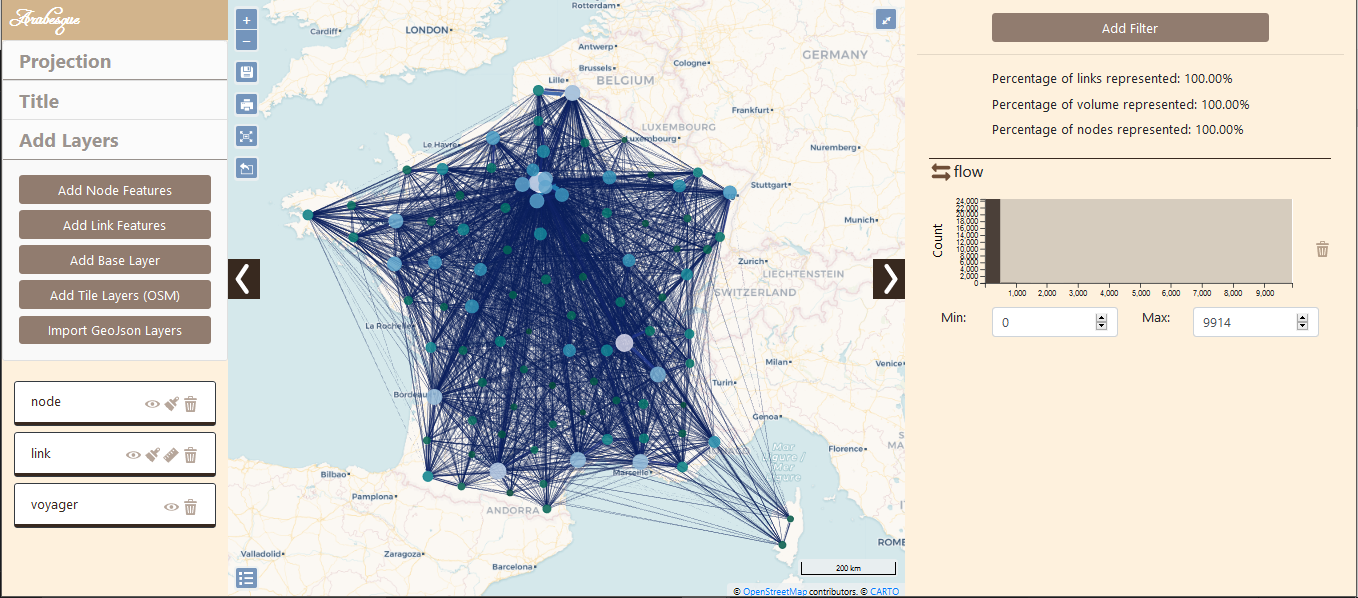
Figure 1. Arabesque Interface
As shown in Figure 1, Arabesque is divided in 3 parts:
the layer panel at the left,
the data handling panel at the right,
the map is in the middle
The layer panel offers functionalities to add, remove and organize layers. From there, you can change the map projection (default is webmercator but others are available) or the title of the map. For each layer, if available, you can access customisation panels (see Figure 2) to change the colour scale, the links shape and size, etc.
The right panel is dedicated to the data. By default, a histogram represents the distribution of the flows. It is also a graph query, i.e. a sliding window that can be adjusted to display only a portion of the distribution. This is shown in Figure 3, where only the flows greater than 100 are displayed. Figure 3 shows another graph query on distance. Arabesque allows the user to define his own filters on the loaded data but also on the automatically created indicators, like, for example, the distance (link size) shown in Figure 3. In the 4 applications reviewed here, Arabesque is the only one to propose that.
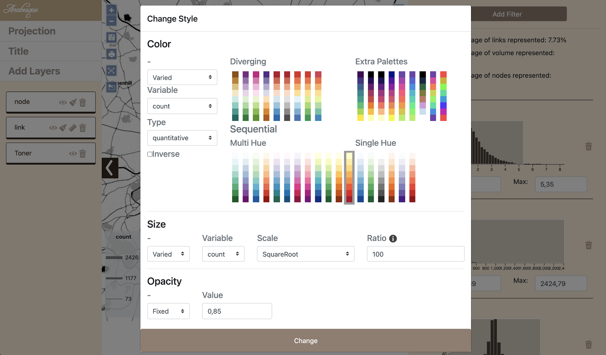
Figure 2. Styling in Arabesque.
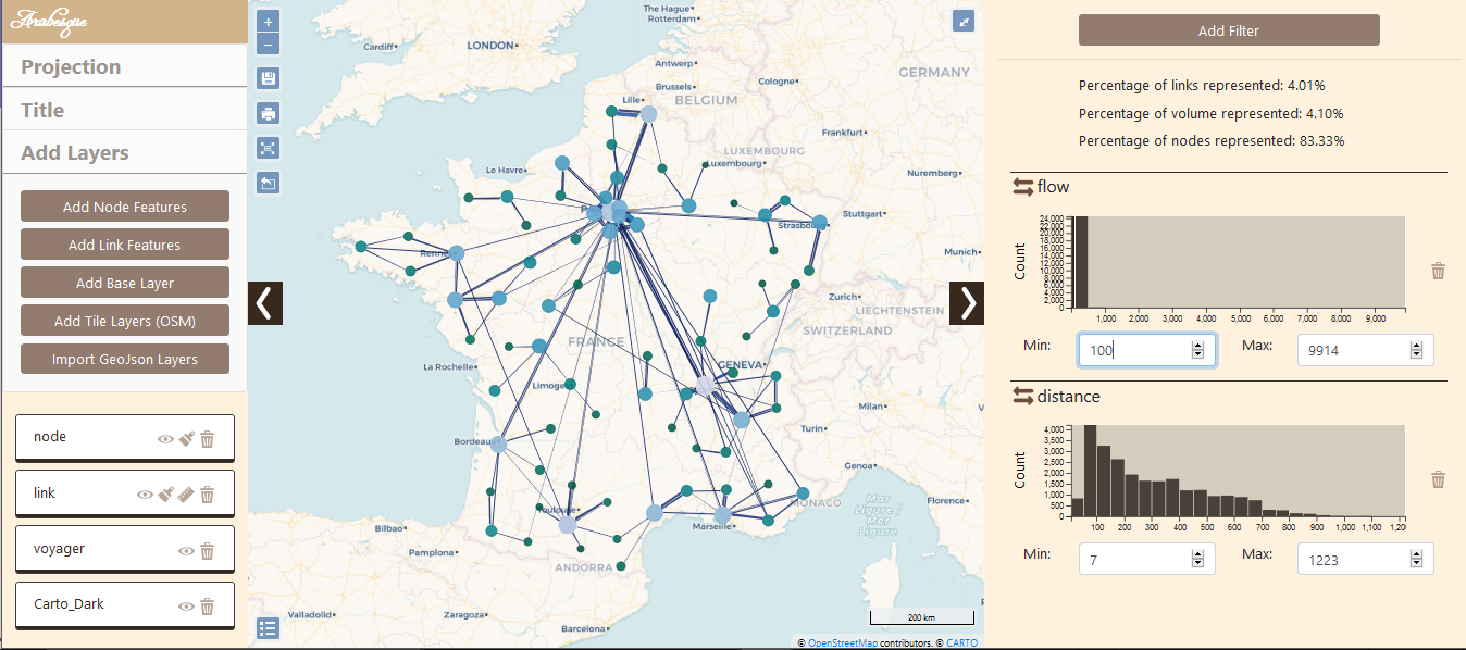
Figure 3. Exploration with Arabesque.
Finally, in the center, the map displays the layers with the chosen symbology according to the filters defined in the data panel.
Kepler
In terms of flow mapping, Kepler.gl offers two rendering modes for data origins destinations, arcs and lines. On the one hand, the arc mode draws an arc between two points to represent a link in 3D. The higher arc represents the greatest distance. Line layers are the 2D version of arc layers (flat on the map). The symbology of arcs and lines can be customized in terms of line stroke and colour and is based on a variable (Figure 4).
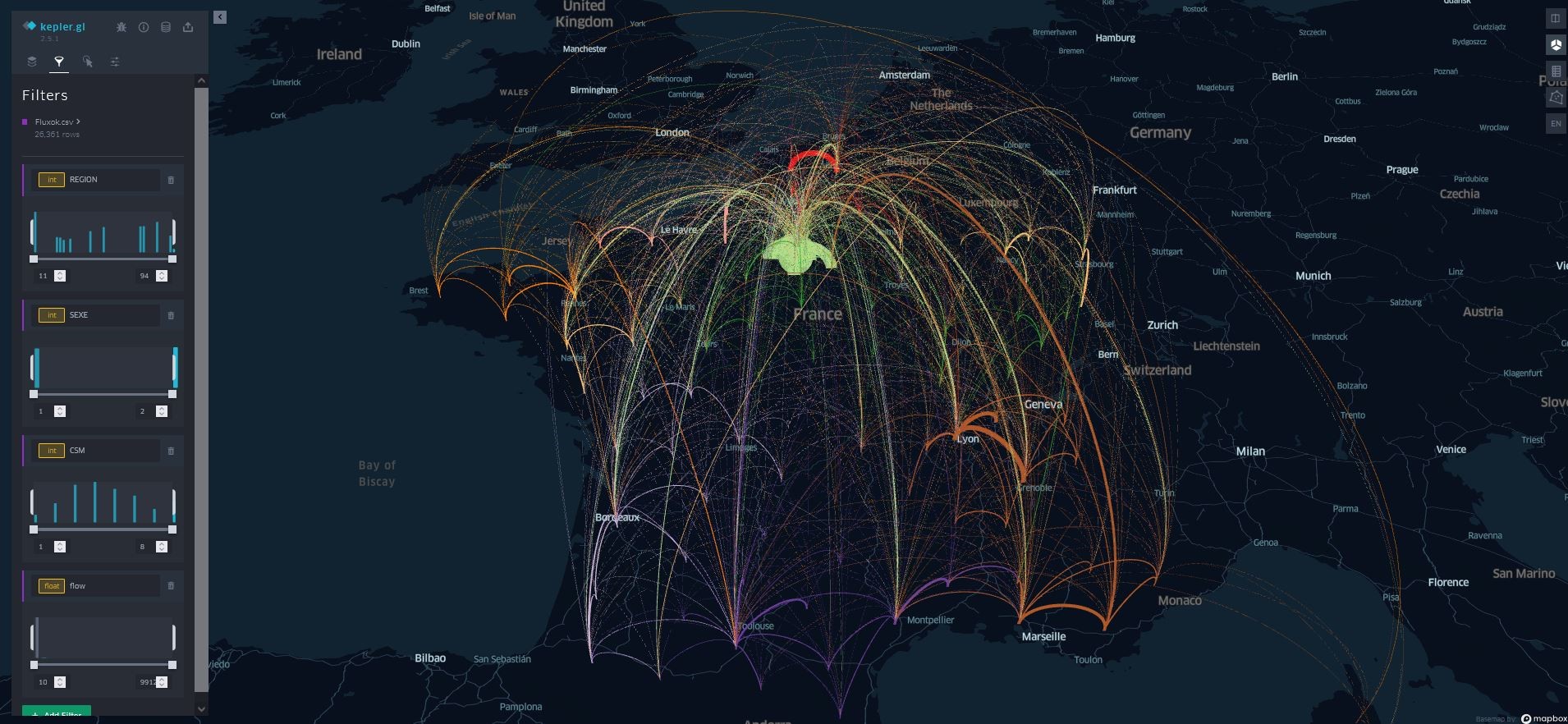
Figure 4. Kepler.gl interface
This method of cartographic design involves applying an angle to the line to turn it into a curve, giving it a more aesthetic appearance (Gu et al., 2018). With 3D, this curvature of the line can be combined with an elevation, which allows the flow to be represented differently (Dorling, 1991). In terms of interactivity, this mode of representation is accompanied by interesting features, such as the selection of a subset of data relating to a departure or arrival area by hovering over the map (brushing), as shown on Figure 4.
- Flowmap.blue: The optimal import of data into flowmap.blue is done with a googlesheet composed of 3 sheets (map properties, locations, flows), a minimal template is proposed. Flowmap only allows you to make a flow map. In the interface (Fig.6.), it is possible to filter by origin or destination as well as to modify the style of the flows and in particular to animate and cluster them.
Flowmap.blue can be efficient for data exploration thanks to its interactivity and the display of toolboxes on locations and flows.
Other customization options are possible but require a mastery of Mapbox, and are to be integrated in the "properties" page of the googlesheet (background modification, filtering by feed directions...). Flowmap.blue also offers a “simplified” approach with a data import page focusing only on locations and flows, via the website.
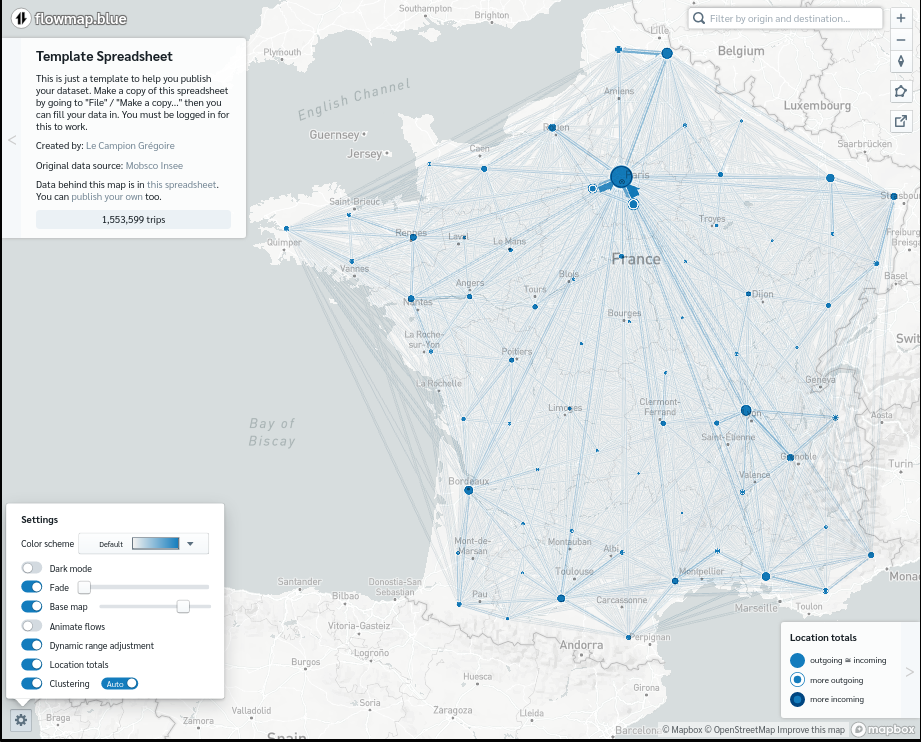
Figure 5. Flowmap.blue interface.
Magrit
Magrit requires an upload in two parts: the geographical points dataset, and the links data. With OD data, Magrit allows to create a single type of map, links between points, but with the option to filter the small links and to group the lines into classes.
After the initial configuration of the map, the user can adjust the style of the representation: colour and size of the links, overall design of the page (titles, mentions, scale bar…).
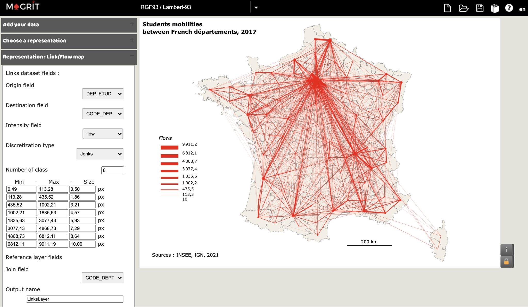
Figure 6. Magrit interface
As shown in Fig. 6, Magrit provides some advanced features to build the map: several discretization modes, number of classes and their limits.
Summary diagram
We tried to present in a synthetic way the different steps involved by the flow mapping web-tools to explore a flow dataset. These steps are organized in five main tasks: data pre-processing, data processing, mapping, exploration and export. The diagram (Figure 8) therefore shows the workflow of a flow map from data to a finalized map and the functionalities offered by each application at each step. To complement this synthetic view, we detail in the next paragraphs the main differences between the functionalities offered by the tools to perform these five main tasks.
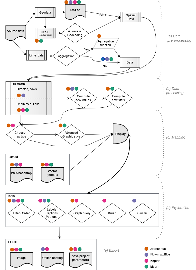
Figure 7. Applications workflows diagram.
Data pre-processing
The pre-processing step does not take into account the data preparation that has to be done by the user, in order to load them in the application. It concerns the processing of the uploaded data by the application to make it conform to its internal data model.
In most applications the data must be provided in the form of two data sets:
- location data (here called geodata), which correspond to the starting and ending points of the flows, i.e. nodes.
- the link data, which concerns the flows between the nodes.
Note that, with the exception of Kepler.gl which takes only one data source, most tools use two different files or tables (one for the nodes and the other for the links).
To spatialize the nodes, there are two cases. The most common is to provide geographic coordinates (latitude and longitude) in the WGS84 coordinate reference system. Another case allows an automatic geocoding of the nodes if in the link file, the identifiers correspond to a known nomenclature already present in the application (e.g. ISO2 UN code for countries). It is then possible to load only the link data and to indicate to which nomenclature the data belong. The links data are then loaded into the application.
The Arabesque application allows you to choose an aggregation function that will be used if several links share the same Origin and Destination.
Data processing
Once integrated, the flows and the spatial data are joined in an Origin-Destination matrix to be processed. Depending on the data, the resulting matrix can be asymmetric, the flows will be directed. If it is symmetrical, the flows will not be directed. Arabesque manages both types of flows. Flowmap.blue handles only directed flows while Magrit and Kepler.gl considers that the flows are not directed. This is an issue because only the most important outgoing flow between two nodes is represented. This limitation will prevent a fine analysis of bilateral flows.
Some tools calculate new indicators. Arabesque automatically calculates the flow distances and common graph statistics for the nodes: inbound and outbound degrees and balance (weighted by the flows or not). Flowmap.blue automatically calculates a new indicator that is used for its clustering function, but these new values are not accessible to the user. Magrit may calculate new values using an expression entered by the user. Arabesque and Magrit can also compute descriptive statistics (mean, median, etc.) and a distribution histogram of all the features (computed or imported).
Mapping
Once the Origin-Destination matrix has been created and the possible indicators calculated, the software will produce the representation. It will then be customizable or not. Arabesque and Kepler.gl allow for further styling of the map whereas Flowmap.blue allows only one type of representation. Magrit proposes several representation modes but only allows the link map for OD data. Arabesque and Magrit offer advanced graphic styles, i.e. it is possible with these tools to modify the style of the links (shape, colour, orientation). Background information can also be added to the map to provide context, either from web resources (Arabesque, Flowmap.blue, Kepler.gl) or from vector files provided by the user (Arabesque, Kepler.gl, Magrit). Note that only Arabesque and Magrit allow to change the map projection. Flowmap.blue and Kepler.gl are limited and can only produce maps in Web Mercator projection. This may be useful for flow data analysis with global datasets but for local datasets a local projection might be wanted for mapping.
Exploration
The data exploration possibilities are, along with the representation/styling possibilities, where the softwares differ the most. The four applications studied in this article offer data sorting and ordering functions. But some features are specific to certain applications. Flowmap.blue, Kepler.gl and Magrit offer functions to display labels and tooltips to provide information about the objects studied. This is a feature missing in Arabesque.
Arabesque and Kepler.gl offer an interesting feature for data exploration: the graph query. By manipulating a window on a graph, this feature allows to hide part of the data in order to highlight the data included in the window.
Kepler.gl also offers a brushing function (brush), which displays only the links present in a radius around the cursor, the other data being hidden. Again, this feature can be useful in an exploratory context or during a demonstration.
Finally, Flowmap.blue offers an original feature of spatial aggregation (clustering), that allows to easily explore the flow at different spatial scales. This aggregation is possible thanks to the calculation of an indicator, not accessible to the user, which allows to aggregate/disaggregate the flows when zooming. Everything is done automatically by the application, the user can activate or deactivate the functionality or choose one of the available aggregation levels. The number of aggregation levels is calculated according to the data by the application.
Export
The export functionalities are also very diverse. The studied applications, with the exception of Flowmap.blue, offer the possibility to export the map in raster (PNG, JPEG) or vector (SVG) image formats. Kepler.gl and Flowmap.blue also offer an online hosting service in order to publish the map on the Web. Arabesque, Kepler.gl and Magrit allow you to save and export your project data and settings in order to be able to reload them afterwards. This is useful to be able to continue the analysis later or share it with a third party and is a great benefit for reproducibility.
Discussion
This comparison shows that these four solutions have different functionalities, flow maps forms and styles. Overall, each tool meet specific needs according to the profiles (technical skills, mapping knowledge) and objectives (communication, exploration, mapping) of the different users (geographer, cartographer, GIS specialist, data scientist, data journalist, urban planner, etc.).
We would like to highlight some elements that might help the user to choose between these tools for a specific task.
Rigor vs design
From the same type of data (OD), these 4 applications based on offer quite varied representation modes (hub lines, arcs, arrows, curved lines). The cartographic “rigor” is not supported by all the tools in the same way and from the same perspective. Arabesque and Magrit, developed by cartographers, are intended for "informed" audiences who are more "rigorous" in terms of graphic semiology. Flowmap.blue and Kepler.gl offer less rigorous but more aesthetic modes of representation, whose design is in line with current trends in online cartography and infoviz.
Analysis, exploration or representation?
Beyond the types of maps, these online applications mainly refer to three types of approaches around flow data: analysis, representation and exploration. Arabesque is the only application offering some flow data analysis functionalities (multivariate filtering, aggregation, selection on distances, network analysis indicators). The exploration dimension through dynamic data interaction (filtering, brushing, hovering) is at the heart of Kepler, Arabesque and Flowmap.blue. In these three interfaces, the user can move around, zoom in, and query elements. Magrit, on the other hand, is more focused on the production of static maps but do not allow navigation and exploration.
Performance
These four applications based on different technologies (D3, DeckGL, MapboxGL) do not offer the same performance in terms of data integration and representation. Because of the use of WebGL and vector tiles, Kepler.gl and flowmap.blue can handle large volumes of data. On the other hand, Magrit and Arabesque are based on D3 javascript technology and have limitations with datasets of several thousand objects.
Interoperability and reproducibility
About the data preparation, 3 out of 4 tools are using data formatted as two separate tables: one for the nodes (geographical points) and one for the links (thematic information). Kepler.gl is apart, it uses a single data table. All the 4 tools can read data with an open format, CSV or GeoJSON. FlowMap.blue imports data hosted in a Google Docs table. It is possible to paste CSV formatted data into the browser tab, but this option renders the project not hostable in the Flowmap.blue website.
Depending on the tools, the dissemination possibilities are very different. While some tools (Kepler.gl, Flowmap.blue) offer to host the results online, others (Arabesque, Magrit) offer to export the map as an image. The choice of the tool can therefore be based on the intended purpose of its use: a dynamic web map or a static illustration for a scientific article or report.
The capability to export the parameters of a project can then constitute a real bonus to transmit the whole work to collaborators and contribute to ease the reproducibility of the analyses.
In 2016, an experiment reproducibility issue has been identified (Baker, 2016). If it is sometimes very difficult to reproduce exactly the conditions of an experiment. Using open source tools can help to attain Computational Reproductibility (Leonelli, 2018), as when data are shared, anyone can reproduce the results. Arabesque, Kepler.gl and Magrit are interesting in this regard. The export function of these tools integrates both the data and the project parameters, making it possible to reproduce the map.
All the tools are open source and their code is auditable. Their processing and data visualization algorithms can therefore be inspected.
Purpose
Among the four tools tested:
1. Kepler and Flowmap.blue are intended for an audience wishing to explore data without the desire to perform statistical analysis and the intention to produce and export a thematic map.
2. Magrit is intended for the realization and production of thematic maps and allows statistical processing to be carried out beforehand.
3. Arabesque is at the interface of these two typical uses: it offers powerful exploration functions, visual parameterization of figures, and statistical analysis possibilities. However, the export and captioning functions needed to produce thematic maps in Arabesque are still limited.
4. Arabesque, like Flowmap.blue, is designed for flow maps. Kepler.gl and Magrit are more generalist and offer other representation modes for other datasets.
5. Arabesque and Magrit target the same audience of researchers and students and come from the same school of French cartography (in the line of Jacques Bertin). Magrit's more general approach allows it to attract a wider audience.
6. Flowmap.blue and Kepler aim more at producing something quickly communicable and are very web publishing oriented.
Conclusion
This article highlights the specificities of Arabesque within the small ecosystem of web applications for mapping flows. Rather than highlighting the flaws and qualities of each tool tested, we observe that these tools meet distinct user needs. The style and type of map produced, the target audience, and the technical skills required to use these applications differ interestingly. Having tested these software on the same dataset, this complementarity is clearly visible.
In the end, the business culture, the user's skills and the final use of the map influence the choice of the tool because it will influence the chosen approaches (exploration and/or analysis) and the expected purposes. Our contribution points out the strengths and limitations of each in order to make an informed choice.
This demonstration also shows that the data does not influence the choice of the tool since all of them worked with the same data set.
Only the formatting will change, which requires the user to be familiar with the format required by the target application and the means necessary to format them.
We note that these applications have been developed in the space of a few years, taking advantage of the rise of geospatial technologies in the web browser. A whole range of needs and possibilities are covered, for the benefits of the community.
References
Bahoken F., Le Campion G., Maisonobe M., Jégou L., Côme É., 2020.« Typologie d’un geoweb des flux et réseaux / Typology of a flow and network geoweb », Géomatica Journal, cdnsciencepub.com/doi/abs/10.1139/geomat-2020-0007; doi.org.10.1139/geomat-2020-0007.
Baker, M., 2016. 1,500 scientists lift the lid on reproducibility. Nature 533, 452–454. doi.org/10.1038/533452a
Bertin J. (1967), Sémiologie graphique. Les diagrammes. Les réseaux. Les cartes, Paris/La Haye, Mouton ; Paris, Gauthier-Villars.
Boyandin I. (2019), Flowmap.blue, Geographic flows visualisation tool for the people, in : CLISEL Conference Ascona 2019, https://ilya.boyandin.me/talks/2019-03-03-clisel/
Carmichael, I., Marron, J.S, 2018. Data science vs. statistics: two cultures?. Jpn J Stat Data Sci 1, 117–138. doi.org/10.1007/s42081-018-0009-3
Côme E., Bapaume T., Jégou L., Bahoken F., Maisonobe M., Roelandt N., Le Campion G. (2019), Arabesque, application d’exploration et de géovisualisation de données de flux et de réseaux, in: Actes de la conférence internationale de géomatique (SAGEO’2019), Session stockages et flux, Clermont-Ferrand, 13-15 novembre 2019, pp. 265-264. Actes_Sageo2019.
Dorling, D. F. L., 1991. The visualisation of spatial social structure (Doctoral dissertation, University of Newcastle upon Tyne).
Giraud T., Lambert N., 2017. Reproducible Cartography. In: Peterson M. (eds) Advances in Cartography and GIScience. ICACI 2017. Lecture Notes in Geoinformation and Cartography. Springer, Cham. https://doi.org/10.1007/978-3-319-57336-6\_13
Gu, Y., Kraak, M.J., Engelhardt, Y., 2018. Revisiting flow maps: a classification and a 3D alternative to visual clutter. Proceedings of the Int. Cartogr. Assoc, 1, 1-7.
He, S., 2020. Data‐Driven Urbanism: The Balance Between Spatial Intelligence and Design Craftsmanship. Architectural Design, 90(3), 86-93.
Le Campion G., Nguyen A., 2019. Dashboard for exploring web applications of geographic flow and movements (DBgFlowiz), IFSTTAR, AME-SPLOTT / COSYS-GRETTIA, and CNRS-UMR Passages.
Leonelli, S., 2018. "Rethinking Reproducibility as a Criterion for Research Quality", Including a Symposium on Mary Morgan: Curiosity, Imagination, and Surprise (Research in the History of Economic Thought and Methodology, Vol. 36B), Emerald Publishing Limited, Bingley, pp. 129-146.doi.org/10.1108/S0743-41542018000036B009
Viry, M., Giraud, T., & Lambert, N., 2018. Magrit: a new thematic cartography tool. In Proceedings of the ICA (Vol. 1, p. 120).
Wang, Y. (2019). Deck. gl: Large-scale web-based visual analytics made easy. arXiv preprint arXiv:1910.08865.
Appendix
Article code source : https://github.com/gflowiz/article_foss4g2021
Arabesque, Kepler.gl and Magrit exported projects :
https://github.com/gflowiz/article_foss4g2021/tree/main/data/projects
Screenshots gallery:
Mobsco dataset:
documentation: : https://www.insee.fr/fr/information/2383297
ADMINEXPRESS dataset:
documentation: : https://geoservices.ign.fr/documentation/diffusion/telechargement-donnees-libres.html
#> processing file: FOSS4G2021_presentation.Rmd
#> output file: FOSS4G2021_presentation.knit.md
#> /usr/local/bin/pandoc +RTS -K512m -RTS FOSS4G2021_presentation.knit.md --to html4 --from markdown+autolink_bare_uris+tex_math_single_backslash --output /Users/runner/work/article_foss4g2021/article_foss4g2021/vignettes/FOSS4G2021_presentation.html --lua-filter /Users/runner/work/_temp/Library/rmarkdown/rmarkdown/lua/pagebreak.lua --lua-filter /Users/runner/work/_temp/Library/rmarkdown/rmarkdown/lua/latex-div.lua --self-contained -V 'mathjax-url=https://mathjax.rstudio.com/latest/MathJax.js?config=TeX-MML-AM_CHTML' -V 'title-slide-class=center, middle, inverse, title-slide' --standalone --section-divs --template /Users/runner/work/_temp/Library/xaringan/rmarkdown/templates/xaringan/resources/default.html --no-highlight --css /Users/runner/work/article_foss4g2021/article_foss4g2021/presentations/xaringan-themer.css --css /Users/runner/work/article_foss4g2021/article_foss4g2021/presentations/custom.css --include-before-body /var/folders/24/8k48jl6d249_n_qfxwsl6xvm0000gn/T//RtmpXu5mF6/xaringand7a2e3af995.md --include-after-body /var/folders/24/8k48jl6d249_n_qfxwsl6xvm0000gn/T//RtmpXu5mF6/xaringand7a667b6173.js --variable math=true
#>
#> Output created: FOSS4G2021_presentation.html
#> presentation rendered